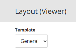
Template
Op de Viewer layout-pagina kan worden gewisseld tussen verschillende templates. Standaard staat het template ingesteld op General. Dit is het algemene template waarin de meeste functionaliteiten van Studio geconfigureerd worden en wat Swing Viewer gebruikt.
Naast het General-template bestaat ook het Print-template. Ondanks de naam wordt dit template niet alleen gebruikt voor het genereren van PDF-documenten, maar óók voor embedded Viewer tiles binnen Mosaic/Stories.
Het Print-template wordt toegepast in alle situaties waarin Swing Viewer een vaste, gestandaardiseerde weergave moet genereren, zoals:
- PDF-export
- Afdrukken
- Embedded Viewer tiles (bijvoorbeeld binnen Mosaic/Stories)
Dit betekent dat aanpassingen in het Print-template niet alleen effect hebben op PDF’s, maar ook op de weergave van Viewer tiles in embedded contexten.
Inhoudsopgave
- Base
- Special values
- Estimation, forecast and provisional data
- Labels
- Title
- Data source
- Footnote
- Legend
- Sub views
- Plot area
- Axes
- Favorite geo item
- Comparison geo item
- Average and regression
- Tables
- Charts general
- Bar
- Profile bar
- Line
- XY
- Points
- Pie
- Benchmark Pie
- Radar
- Map
- Color schemes
- Dimensions
- Interactive presentations
Base
- Base font
- Base color
- Base border
- Base background
- Base transparency
- Show variable description in Excel export
Base font
This is the default font type that is used in graphical presentations.
Base color
This is the default color that is used in presentations. For example, the text color or the color to draw the axes.
For some parts of the presentation there is a specific setting and their color can be adjusted.
Base border
The default border. This border is used when other borders (i.e. the border of the legend) are not defined.
Base background
This is the default background.
When other backgrounds (i.e. the background of the data source) are not defined, the default background is used.
Base transparency
The transparency of the charts.
The value runs from 0% to 100% where 100% completely transparent is.
Show variable description in Excel export
If enabled, the variable description will be displayed beneath the presentation.
Special values
- Special values brush
- Empty values brush
- NA brush
- Missing values brush
- Hidden values brush
- Percentages round off value
- Z-Scores round off value
- Growth percentage round off value
- Growth index round off value
Special values brush
It can happen that values are missing, unknown, not applicable or hidden.
For these special values you can set a background color if desired.
Empty values brush
A background color can be set for values that are missing from the database.
When this value is not defined, the 'Special values brush' is used.
NA brush
A background color can be set for not applicable values (-99998) if desired.
If this value is not defined, the 'Special value brush' will be used.
Missing values brush
A background color can be set for missing values (-99999) if desired.
If this value is not defined, the 'Special value brush' will be used.
Hidden values brush
For hidden values, for example values under a given threshold, a background color can be set.
In case this value is not defined, the 'Special values brush' is used.
Percentages round off value
Percentage rounding value which will be used in the presentation.
For example, 0.1 will be a rounding value to 1 decimal place, 0.01 to 2 decimal places.
Z-Scores round off value
Z-scores rounding value which will be used in the presentation.
For example, 0.1 will be a rounding value to 1 decimal place, 0.01 to 2 decimal places.
Growth percentage round off value
Growth percentage rounding value which will be used in the presentation.
For example, 0.1 will be a rounding value to 1 decimal place, 0.01 to 2 decimal places.
Growth index round off value
Growth index rounding value which will be used in the presentation.
For example, 0.1 will be a rounding value to 1 decimal place, 0.01 to 2 decimal places
Estimation, forecast and provisional data
- Display settings of estimated values
- Estimated values font color
- Estimated values brush
- Display settings of forecasted values
- Font for forecasted values
- Forecasted values font color
- Forecasted values brush
- Display settings of provisional values
- Font for provisional values
- Provisional values font color
- Provisional values brush
Display settings of estimated values
Estimated values font color
This is the font used for estimated values.
By default the base font is used.
Depending on the presentation type, only part of the setting is used.
Estimated values brush
The font color of estimate values.
By default, the base color is used.
Display settings of forecasted values
Font for forecasted values
This is the font used for forecasted values.
By default, the base font is used.
Depending on the presentation type, only part of the setting is used.
Forecasted values font color
The font color of forecast values.
Forecasted values brush
The drawing properties of forecast values.
These are used for the coloring of the chart.
Display settings of provisional values
Font for provisional values
This is the font used for provisional values.
By default, the base font is used.
Depending on the presentation type, only part of the setting is used.
Provisional values font color
The font color of provisional values.
Provisional values brush
The drawing properties of provisional values.
These are used for the coloring of the chart.
Labels
- Show names
- Show values
- Use short names
- Show parent area names
- Confidence interval
- Confidence interval line
- Show real value when using transformation
- Only show the original value when using transformations
- The sign shown after percentages
- Label background transparency
- Label font
- Label font color
- Show level in the name of geo item and compare item
- Show unit in indicator name
- Maximum number of labels
- Add dimension level to cube dimension item names
Show names
If enabled, the names will be displayed when possible.
It can be that there are too many labels. In this case the labels won't be shown.
Show values
If enabled, the values will be displayed when possible.
It can be that there are too many labels. In this case the labels won't be shown.
Use short names
When this setting is turned on, short names will be used where applicable.
Show parent area names
When drilling down to an area level with this option turned on, the parent areas name is displayed in front of the areas.
Confidence interval
There are 4 possible values for the confidence interval:
- Off
- 90%
- 95%
- 99%
Confidence interval line
The confidece interval line properties of a bar chart.
Show real value when using transformation
If enabled, the underlying value of a data transformation will be displayed in parentheses behind the transformed value.
Only show the original value when using transformations
If enabled, the underlying value of a data transformation will be displayed instead of the transformed value. This option is only usable in colored table and map presentations, where the colors already indicate the transformed values.
The sign shown after percentages
It is possible to choose a text that is shown behind percentages in presentations. For example, "%".
Label background transparency
The transparency of a label’s background.
A value between 0% and 100% can be set. 100% is completely transparent.
Label font
The font type that is used for displaying the labels.
Label font color
The color of the font that is used for displaying the labels.
Show level in the name of geo item and compare item
Show the area level name of the selected area and comparison area before the area name itself when displayed in a presentation.
Show unit in indicator name
If enabled, the unit name will be displayed in the indicator name if indicators with different units are selected.
Maximum number of labels
The maximum number of labels displayed on a map.
Add dimension level to cube dimension item names
When presenting cube indicators it is sometimes unclear at the time when the presentation is displayed, which cube dimension originates from which cube dimension.
This setting enables the dimension name to be shown in the presentation in front of the item name.
Title
- Show title
- Title font
- Title color
- Title border
- Title margin
- Title position
- Title alignment
- Title background color
- Encoded title
Show title
This setting enables you to hide the title of a presentation.
Important: This setting is only visible in report presentations and when printing or exporting a presentation.
The following image shows from which parts the presentation is built.
Title font
This setting enables you to change the font of the title.
Important: This setting is only visible in report presentations and when printing or exporting a presentation.
In the following image you can see an explanation of position, borders and margin.
Title color
This setting enables you to change the color of the title.
Important: This setting is only visible in report presentations and when printing or exporting a presentation.
In the following image you can see an explanation of position, borders and margin.
Title border
This setting enables you to change the border of the title.
Important: This setting is only visible in report presentations and when printing or exporting a presentation.
In the following image you can see an explanation of position, borders and margin.
Title margin
This setting enables you to change the margin of the title.
Important: This setting is only visible in report presentations and when printing or exporting a presentation.
The following image shows an explanation of margins.
Title position
This setting enables you to change the positioning of the title.
Important: This setting is only visible in report presentations and when printing or exporting a presentation.
In the following image you can see an explanation of position, borders and margin.
Title alignment
This setting enables you to change the alignment of the title.
Important: This setting is only visible in report presentations and when printing or exporting a presentation.
In the following image you can see an explanation of alignment.
Title background color
This setting enables you to change the background color of the title.
Important: This setting is only visible in report presentations and when printing or exporting a presentation.
The following image shows from which parts the presentation is built.
Encoded title
The title of a presentation can be generated by Swing on the basis of codes.
The following codes can be used in a title:
- %a = indicator / theme
- %e = unit
- %p = period
- %pk = period short name
- %g = area
- %S = scenarios
- %t = theme
- %P = periods (maximum 8)
- %Pk = periods short name (maximum 8)
- %s = scenario
- %tr = transformation
When the multi language module is enabled, the encoded title will be used as title for Viewer Presentation tiles and the Detailview for these tiles. This setting is translatable.
Data source
- Show source
- Source in legend
- Source font
- Source color
- Source border
- Source background
- Source margin
- Source position
- Source alignment
Show source
With the setting 'Show source' can you select whether the source will be displayed in the legend or under the chart.
Important: This setting is only visible in report presentations and when printing or exporting a presentation.
The following image shows from which parts the presentation is built.
Source in legend
With the setting 'Show source' can you select whether the source will be displayed in the legend or under the chart.
Important: This setting is only visible in report presentations and when printing or exporting a presentation.
The following image shows from which parts the presentation is built.
Source font
This setting enables you to change the font of the source.
Important: This setting is only visible in report presentations and when printing or exporting a presentation.
The following image shows from which parts the presentation is built.
Source color
This setting enables you to change the font color of the source.
Important: This setting is only visible in report presentations and when printing or exporting a presentation.
The following image shows from which parts the presentation is built.
Source border
This setting enables you to set a border around the source.
Important: This setting is only visible in report presentations and when printing or exporting a presentation.
The following image shows from which parts the presentation is built.
Source background
This setting enables you to set a background color for the source.
Important: This setting is only visible in report presentations and when printing or exporting a presentation.
The following image shows from which parts the presentation is built.
Source margin
This setting enables you to change the margin between the source and the presentation.
Important: This setting is only visible in report presentations and when printing or exporting a presentation.
In the following image you can see an explanation of position, borders and margin.
Source position
This setting enables you to change the position of the source.
Possible positions:
- Left
- Right
- Bottom
- Top
Important: This setting is only visible in report presentations and when printing or exporting a presentation.
In the following image you can see an explanation of position, borders and margin.
Source alignment
This setting enables you to change the alignment of the source.
Important: This setting is only visible in report presentations and when printing or exporting a presentation.
In the following image you can see an explanation of alignment.
Footnote
Show footnote
This setting allows you to enable or disable that the indicator footnotes are displayed.
Important: This setting is only visible in report presentations and when printing or exporting a presentation.
Legend
- Show legend
- Show legend title
- Show unit in legend
- Show special values in legend
- Show favorite area value in legend
- Legend font
- Legend color
- Legend border
- Legend background
- Legend position
- Horizontal legend alignment
- Legend margin
- Legend items margin
- Legend icon and text margin
Show legend
This setting enables you to turn the legend on or off.
Important: This setting is only visible in report presentations and when printing or exporting a presentation.
The following image shows from which parts the presentation is built.
Show legend title
This setting displays the title of the legend.
Important: This setting is only visible in report presentations and when printing or exporting a presentation.
Show unit in legend
With this setting it can be set whether the unit used in the presentation should also be displayed in the legend.
Show special values in legend
With this setting it can be turned on that special values are displayed in the legend.
Show favorite area value in legend
With this setting it can be turned on that the favorite value is displayed in the legend.
Legend font
This setting enables you to change the font of the legend.
Important: This setting is only visible in report presentations and when printing or exporting a presentation.
The following image shows from which parts the presentation is built.
Legend color
This setting enables you to change the text color of the legend.
Important: This setting is only visible in report presentations and when printing or exporting a presentation.
The following image shows from which parts the presentation is built.
Legend border
This setting enables you to change the border of the legend.
If there is no border defined, the base border is used.
Important: This setting is only visible in report presentations and when printing or exporting a presentation.
In the following image you can see an explanation of position, borders and margin.
Legend background
This setting enables you to set a background color for the legend.
Important: This setting is only visible in report presentations and when printing or exporting a presentation.
The following image shows from which parts the presentation is built.
Legend position
This setting enables you to change the position of the legend.
Possible positions:
- Left
- Right
- Under
- Above
Important: This setting is only visible in report presentations and when printing or exporting a presentation. The table presentation requires custom css because this is not a graphical presentation
In the following image you can see an explanation of position, borders and margin.
Horizontal legend alignment
The alignment of the legend.
Important: This setting is only visible in report presentations and when printing or exporting a presentation.
Legend margin
This setting enables you to change the margin between the legend and the presentation.
Important: This setting is only visible in report presentations and when printing or exporting a presentation.
In the following image you can see an explanation of position, borders and margin.
Legend items margin
This setting enables you to change the margin between the legend items.
Important: This setting is only visible in report presentations and when printing or exporting a presentation.
The following image shows from which parts the presentation is built.
Legend icon and text margin
This setting enables you to change the margin between the icon and the legend text.
Important: This setting is only visible in report presentations and when printing or exporting a presentation.
The following image shows from which parts the presentation is built.
Sub views
Positioning of child views
Positioning of image parts.
When a presentation consist of two image parts, these parts can be placed under or next to each other.
In the image below they are next to each other.
This setting indicates the positioning of both images.
The possibilities are:
- Horizontal: if possible, the images are placed next to each other. In case of two or more presentations, the images are also placed under each other.
- Vertical: if possible, the images are placed under each other. In case of two or more presentations, the images are also placed next to each other.
- Auto: the optimal positioning is determined by the system.
- Always horizontal: the images are always placed next to each other.
- Always vertical: the images are always placed under each other.
Sub title font
The font of the sub titles.
The sub titles are the titles of the image parts of a presentation.
The following image provides an example of the attributes of a sub title.
Sub title font color
The color of the sub titles.
The sub titles are the titles of the image parts of a presentation.
The following image provides an example of the attributes of a sub title.
Sub title margin
The margin of the sub titles.
The sub titles are the titles of the image parts of a presentation.
The following image provides an example of the attributes of a sub title.
Sub title position
The position of the sub titles.
Possible positions:
- Top left
- Top middle
- Top right
- Bottom left
- Bottom middle
- Bottom right
The sub titles are the titles of the image parts of a presentation.
The following image provides an example of the attributes of a sub title.
Plot area
- Plot area border
- Plot area left border
- Plot area right border
- Plot area top border
- Plot area bottom border
- Grid line
- Horizontal grid line
- Vertical grid line
- Crop empty white space
Plot area border
The properties of the chart area borders.
These can be overwritten by the individual settings for the borders above, under, left or right.
The following image provides an explanation of borders, position, and margin.
Plot area left border
The properties of the chart area's left border.
These overwrite the general border settings.
The following image provides an explanation of borders, position, and margin.
Plot area right border
The properties of the chart area's right border.
These overwrite the general border settings.
The following image provides an explanation of borders, position, and margin.
Plot area top border
The properties of the chart area's top border.
These overwrite the general border settings.
The following image provides an explanation of borders, position, and margin.
Plot area bottom border
The properties of the chart area's bottom border.
These overwrite the general border settings.
The following image provides an explanation of borders, position, and margin.
Grid line
The properties of a graph’s grid lines.
These can be overwritten by the properties of the horizontal or vertical grid lines.
Horizontal grid line
The properties of a graph’s horizontal grid lines.
These settings overwrite the default grid line properties.
Vertical grid line
The properties of a graph’s vertical grid lines.
These settings overwrite the default grid line properties.
Crop empty white space
If enabled, excessive white space surrounding the chart will be removed. This setting only applies to report presentations or when a presentation is printed or exported.
Axes
- X-axis font
- X-axis font color
- X-axis pen as grid line
- Show X-axis labels at an angle
- Y-axis font
- Y-axis font color
- Show Y-axis labels at an angle
- Margin for maximum Y-axis value
- Show ticks on axis
- Omit X-axis labels
- Skip labels
X-axis font
The font of the X-axis labels.
X-axis font color
The text color of the X-axis labels.
X-axis pen as grid line
If there are both positive and negative values in a bar chart or a line diagram, the X-axis will fall inside the plot area. This setting defines the pen for drawing the X-axis.
Show X-axis labels at an angle
The font of the Y-axis labels.
Y-axis font
The font of the Y-axis labels.
Y-axis font color
The text color of the Y-axis labels.
Show Y-axis labels at an angle
Display labels on the Y-axis at a 45° angle.
Margin for maximum Y-axis value
The margin of the Y-axis in percentage.
For example, a property value of 20 means, that there is a 10% extra margin set at the bottom and at the top of the chart.
Show ticks on axis
If enabled, ticks will be displayed on the axis.
Omit X-axis labels
This setting enables you to set weather it is allowed to omit labels on the X-axis, if they don't fit. Warning: if you disable this function, the axis labels might overlap.
Skip labels
The number of labels that has to be skipped when displaying an axis.
Favorite geo item
Favorite area pen
The drawing properties of the line surrounding the favorite area.
This could, for example, be used when formatting the outline of the favorite area on a map.
Favorite area brush
The drawing properties of the favorite area.
These are used for the coloring the chart.
Favorite area font color
The text color in the text representation of the favorite area (in the table or chart labels).
Favorite area font
The font of the favorite area.
Comparison geo item
Different display of comparison areas
Enable this setting to modify the presentation of the comparison area. (e.g. color)
Comparison area brush
The drawing properties of the comparison geo item.
These are used for the coloring the chart.
Comparison area font color
The color of text representations of the comparison geo item (in tables or chart labels).
Average and regression
Show average line
If enabled, an average line will be displayed.
Average line pen
The properties of the average line.
Show regression line
If enabled, a regression line will be displayed.
Regression line pen
The drawing properties of the regression line.
Tables
Show vertical totals
If enabled, vertical totals will be displayed.
Show horizontal totals
If enabled, horizontal totals will be displayed.
Charts general
- Hide empty rows/columns
- Chart background
- Serie color gradient factor
- Serie color gradient style
- Serie border color
- Serie border color width
- Use round off values to draw the data
Hide empty rows/columns
Empty rows/columns can be hidden if there is no data for the entire row or column.
Chart background
The background of a chart.
This is the chart area where bars, lines and similar items are presented.
For an example, see the image below.

Serie color gradient factor
The gradient factor of a chart serie.
The gradient factor is the degree to which one color runs into the other.
One chart can contain multiple series.
These can be bar groups or multiple lines in a line graph.
See image below.
Serie color gradient style
The gradient style of a chart serie.
One chart can contain multiple series.
These can be bar groups or multiple lines in a line graph.
The following options are available:
- None (default)
- Middle
- Diagonal left
- Diagonal right
- Horizontal middle
- Left to right
- From top to bottom
- Vertical middle
See image below.
Serie border color
The border color of a chart serie.
One chart can contain multiple series.
These can be bar groups or multiple lines in a line graph.
See image below.
Serie border color width
The border width of a chart serie.
One chart can contain multiple series.
These can be bar groups or multiple lines in a line graph.
See image below.

Use round off values to draw the data
It is possible to round off the decimal places of a variable.
With this setting on true, these round off values are used to display the data.
Otherwise the real data is used to draw.
Bar
- Show bars (horizontal) or columns (vertical)
- Bar drawing style
- Bar color
- Minimum space (in %) that a bar chart should consist of
- Show icon for additional information on special values
Show bars (horizontal) or columns (vertical)
Display bars in bar charts as bars (horizontal) or column (vertical).
Bar drawing style
The various style options are shown in the image below:
When using interactive presentations, animation is not available for the style types Emboss and Wedge.

Bar color
The color of the bars in presentations:
- Bar & Point
- Bar & Line
Minimum space (in %) that a bar chart should consist of
The minimum space that the bar chart occupies in the plot area.
This prevents the use of a narrow bar when there is only one bar in the chart.
Show icon for additional information on special values
Show icon when additional information is available for data.
When data has additional information, this will be shown in a tooltip of the chart element.
If such chart element is unavailable (e.g. for special values), an icon can be added which will show the tooltip.
Profile bar
Reference color
The color of the reference bar in a Profile bar chart.
Line
- Show normal or fluid line
- Marker style
- Marker size
- Marker color
- Marker border color
- Line styles in line and radar charts
- Line width in line and radar charts
- Line style in bar & line chart
- Style of first line in 2 lines chart
- Style of second line in 2 lines chart
Show normal or fluid line
Should a normal line (Line) or a smooth line (Spline) be drawn?
Marker style
The style of the markers.
The markers are the points on a line in a line chart or the points in a point or bar chart.
The possibilities are:
- None
- Circle
- Diamond
- Cross
- Square
Marker size
The size of the markers.
The markers are the points on a line in a line chart or the points in a point or bar chart.
Marker color
The color of the markers.
The markers are the points on a line in a line chart or the points in a point or bar chart.
Marker border color
The border color of the markers.
The markers are the points on a line in a line chart or the points in a point or bar chart.
Line styles in line and radar charts
A list of the line styles in a graph.
The different line styles are separated by a semicolon ( ; )
There is a popup in the layout settings to be able to edit the list easily, but it is also possible to enter the list directly. The following styles are possible:
| Style | Use in list |
|---|---|
| Default | Solid |
| Stripe | Dash |
| Point | Dot |
| StripePoint | DashDot |
| StripePointPoint | DashDotDot |

Line width in line and radar charts
The width of a line.
Line style in bar & line chart
The drawing properties of a line.
Style of first line in 2 lines chart
The drawing properties of the first line in a 2 lines chart.
Style of second line in 2 lines chart
The drawing properties of the second line in a 2 lines chart.
XY
- Point size
- Point color
- Show standard lines
- Standard line pen
- Standard line value X-axis
- Standard line value Y-axis
- Show standard areas
- Standard area left bottom color
- Standard area left top color
- Standard area right top color
- Standard area right bottom color
- Standard area left bottom text
- Standard area left top text
- Standard area right top text
- Standard area right bottom text

Point size
The size of the markers.
These are the points of the XY diagram.
Point color
The color of the markers.
These are the points of the XY diagram.
Show standard lines
Show standard lines in an XY graph
Standard lines can be used to create a priority matrix. The administrator chooses a value on the X-axis and Y-axis based on established standards. The output of the XY plot can subsequently be interpreted by its position in one of the four distinct rectangles created by both standard lines. The image below provides an example. If a point is in the lower-left area, it falls into the 'Enhance' category.
Standard line pen
The drawing properties of the standard line in the XY graph
Standard line value X-axis
The value of the standard line in the XY graph on the X-axis
Standard line value Y-axis
The value of the standard line in the XY graph on the Y-axis
Show standard areas
Display standard areas in an XY graph
Standard areas can be switched on if standard lines are drawn. The surfaces that result from drawing the standard lines can be provided with a label and background color. In this way, a priority matrix can be created which, based on colors, indicates the category in which a certain point in the XY plot is located.
Standard area left bottom color
The color of the standard area at the bottom left in an XY graph
Standard area left top color
The color of the standard area at the top left in an XY graph
Standard area right top color
The color of the standard area at the top right in an XY graph
Standard area right bottom color
The color of the standard area at the bottom right in an XY graph
Standard area left bottom text
The text belonging to the standard area at the bottom left in an XY graph, the text is shown in the legend
Standard area left top text
The text belonging to the standard area at the top left in an XY graph, the text is shown in the legend
Standard area right top text
The text belonging to the standard area at the top right in an XY graph, the text is shown in the legend
Standard area right bottom text
The text belonging to the standard area at the bottom right in an XY graph, the text is shown in the legend
Points
Marker style
The style of the markers.
These are the markers in a Bar & Point chart or a Profile bar.
The possibilities are:
- Circle
- Diamond
- Stripe
Point size
The size of the points.
These are the points in a Bar & Point chart or a Profile bar.
The given size is a percentage of the maximum size.
The maximum size is approximately the width of a bar.
Stripe width
The width of a stripe marker.
Marker color
The color of the markers.
These are the markers in a Bar & Point chart or a Profile bar.
Pie
Pie or doughnut
Whether a pie chart is shown as a pie or a donut.
Pie chart drawing style
The drawing style of a pie chart.
The options can be found in the image below.

Pie chart label style
The label style of a pie chart.
The labels can be placed inside or outside of the pie.
Benchmark Pie
- Encoded title for the pie center
- Open URL in new window
- Show indicator ring in benchmark pie in map
- Use default labels for indicators
Encoded title for the pie center
The text that is displayed in the innermost circle of a benchmark pie.
The following codes can be used in the title:
- %p = period
- %pk = period short name
- %g = area
Open URL in new window
In benchmark pies it is possible to add links to the individual pie parts.
If this setting is enabled, clicking on the parts of the chart opens the URL in a new window.
Show indicator ring in benchmark pie in map
This setting disables the indicator ring in a benchmark pie. An indicator ring is only used in map presentations.
Use default labels for indicators
With the help of this setting you can assign default numeric labels to all indicators in the benchmarkpie tree.
Radar
Radar chart drawing style
The drawing style of the radar chart.
The possibilities are:
- Area
- Line
- Marking
Show Marker
If enabled, the markers will also be shown on the chart if the drawing style is set to area or line.
Marker size
The size of the markers.
The markers are the points on a line in an area chart.
Radar chart label style
The label orientation in a radar chart.
There are three possibilities:
- Circular (perpendicular to the axis)
- Horizontal
- Radial (in the direction of the axis)
Radar chart X-axis lines
Defines the pen for drawing the X-axis lines in radar charts.
Map
- Map color
- Show outlines
- Area outline
- Area outline when the mouse is hovering the presentation
- Geolevel
- Transparency data layer
- Calculate legend based on all areas
Map color
The color of a map.It is used in "bar in map" and "pie in map" to display the map.Show outlinesThis setting enables an area’s outline to be turned on or off in map presentations.Area outlineThe outline properties of an area in map presentations.Area outline when the mouse is hovering the presentationThe outline properties of areas in map presentations when the cursor is moved over the presentation. This setting only applies to interactive presentations.GeolevelThe area level for drawing the map.When the chosen value is 'Selected', the area level selected in the presentation will be displayed.Transparency data layerThe transparency of the choropleth layer when there is another map layer underneath it.Calculate legend based on all areasThe boundaries of the data classes in the legend are normally calculated based on the selected areas. If this option is turned on, the boundaries are calculated based on all areas from the selected comparison area. This option only works if a comparison area is selected.Color schemes
Default sequential color scheme
In a sequential color scheme the colors are running from light to dark or vice versa.
They are mainly used in choropleth maps with numbers or average values.
See the example color scheme below.

Default diverging color scheme
In a diverging color scheme the colors are running from a middle value to 2 contrasting colors.
They are used among others for Z-scores and growth figures.
See the example color scheme below.

Default qualitative color scheme
Qualitative color schemes are used among others by bar charts and enumeration indicators in a map.
The colors are in principle independent of each other and therefore do not run into each other.
They don't indicate a number but a 'quality'.
See the example color scheme below.

Dimensions
- Custom data class name for values much lower than the reference
- Custom data class name for values lower than the reference
- Custom data class name for values within range of the reference
- Custom data class name for values higher than the reference
- Custom data class name for values much higher than the reference
- Maximum size of a chart on a map

Custom data class name for values much lower than the reference
The text that is displayed when the value is much lower than around the average.
Custom data class name for values lower than the reference
The text that is displayed when the value is lower than around the average.
Custom data class name for values within range of the reference
The text that is displayed when the value is around the average.
Custom data class name for values higher than the reference
The text that is displayed when the value is higher than around the average.
Custom data class name for values much higher than the reference
The text that is displayed when the value is much higher than around the average.
Maximum size of a chart on a map
Maximum size of a chart on a map. The final size will be calculated based on the number of selected areas.
Interactive presentations
- Use animation when drawing the presentation
- Use animation when the mouse is hovering the presentation
Use animation when drawing the presentation
Use animation when the mouse is hovering the presentation
Was dit artikel nuttig?
Dat is fantastisch!
Hartelijk dank voor uw beoordeling
Sorry dat we u niet konden helpen
Hartelijk dank voor uw beoordeling
Feedback verzonden
We stellen uw moeite op prijs en zullen proberen het artikel te verbeteren